Flexible web design
Responsive web design
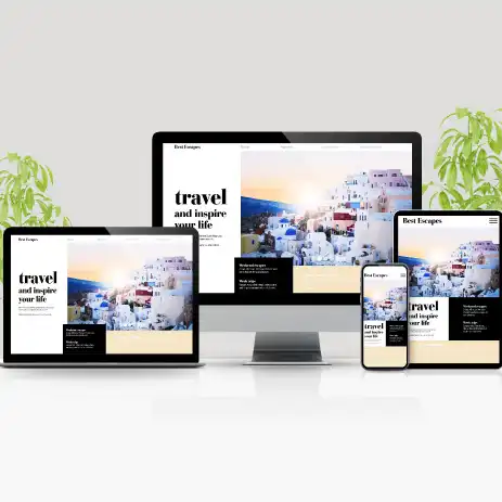
Flexible Layout is a website building approach for responsive design, cascading stylesheet media queries, and flexible images. The basic task of responsive design is the creation of web pages that recognize the size and orientation of the visitor's screen and change their appearance accordingly.
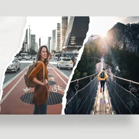
It was possible to easily arrange page elements when designing Internet pages ten years ago because screen dimensions were generally accepted. There was no need to take care of the placement of elements and the uncluttered way of viewing content. With the advent of smartphones, the situation has changed. Smaller devices are used to access the Internet, which people use more and more. All this resulted in Responsive Web Design (RWD) and the need for adjustments.
Quality responsive design is a must for good websites. Google SEO (search engine optimization) checks this item especially as a key parameter in positioning. Pages that are responsive and optimized for mobile phones are better positioned during searches and have more traffic. Flexible visual content, fluid grids and media queries are the main elements that determine responsive design.
The necessity of responsive web design
With the release of smartphones on the market, there was a small boom in the use of the Internet, which increasingly resembles mini computers with all the capabilities of a desktop. It is predicted that this trend will continue to intensify and that mobile platforms will occupy an even larger market. Your brand must also be visible on an iPhone, Android or tablet device. For this accelerated process, it is necessary to have mobile optimized websites.

Web design
We do web design for all clients, and the design of all pages uses the latest standards so that users have an excellent user experience with a visually attractive appearance
Creation of web banners
Your products and services can be noticed in an attractive way by displaying a banner. An important part of advertising for companies is the use of banners for advertising purposes

Web marketing
Website optimization for higher search engine positions and Internet advertising for targeted and increased traffic/visits. Content creation from the technical side